I'm going to tell you how to recognise a good marketer from his work on flyers. I came across 3 flyers for meal delivery / preparation and saw some characteristics that are useful for understanding marketing in the visual sense.
The first flyer is from food delivery service Plum. I'm glad to have found empathy for the office drone's plight of eating alone. Now that I've associated Plum with eating and being sociable though, this train of thought isn't brought to its rumbling, inevitable conclusion. Invite me to tell my friends about Plum. You've already got me thinking about eating with friends anyway.
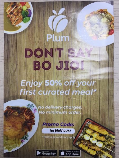
Unfortunately the flyer has a glaring problem with colour. The colours of the scissor cut curry rice and skewer bento set don't make the food more appetising. Colour balance looks skewed towards yellow and green. The bento looks like it is wilting (too yellow) while the meatballs look unappetising as well (too green).
We can solve the problem of the food photo with a change. With a photo of a few people eating together, Bo Jio becomes the dominant message. Who even needs food photos at this point.
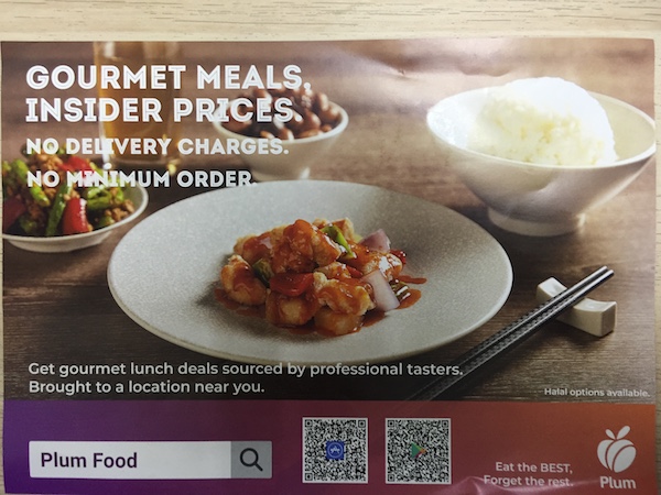
The second flyer is also from Plum. I love the work done with the food photography on this version. The sweet and sour chicken looks incomparably better than the 4 foods on display in the first flyer. It is exhibit A in the case that quality trumps quantity. To me, it is clear that even though I am not a lover of sweet and sour chicken, the fact that it is presented front and centre in high quality gives me a favourable impression. This is more impactful compared to a photo collage of several foods, even if i like one of them a lot more than sweet and sour chicken. There's simply too much to distract me.
With this second flyer, i also like that the following features are prominent: "No delivery charges" and "No minimum order". You might ask why? Why not talk about the wide selection of meals, meal quality, ingredient freshness and so on? The answer is loss aversion. Like most people, I find the prospect of losing my health terrifying, but am not attracted to the idea of getting more healthy. In fact, i would argue that these 2 features are more persuasive than a discount off the first order. I am more likely to give the product a try because of these factors than a discount.
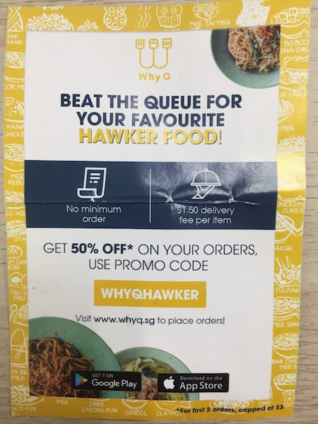
The third and final flyer that I saw was from Why Q. The Why Q flyer is smaller and less visual than the Plum flyers. It even has a thick border that lessens available space still further. Food photos take up a relatively meagre part of the visual real estate. Despite these shortcomings, I like this flyer best.
Like the second Plum flyer, it addresses the topics of delivery charges and minimum orders. Unlike Plum, these are arguably the most important talking points on the flyer. They occupy the very middle of the flyer, are highlighted in a different colour, and are given icons to accentuate their meaning.
Unlike the 2 Plum flyers, the headline text addresses a pain point. "Beat the queue for your favourite hawker food" is a strong one too. There's a piece of startup wisdom that goes "don't be a vitamin, be a painkiller". This proves it perfectly.
When you put it all together, the Why Q flyer is a higher quality piece of work. From beating the queue to minimum orders, each piece of information gives me relief from a pain point. By comparison, in version one, Plum plays on fear of missing out or social validation (Bojio), and then delivery / minimum orders. In version two, I'm baited with gourmet meals and then pitched minimum orders and delivery charges again. None are as powerful as Why Q's stack of pain relief points.