So Whatsapp is worth $19 billion dollars!

Ever stopped to wonder, what does the website of a company worth more than the world music industry look like? I decided to take a closer look at the website of the world's most valuable IM software, and here's what I found.
Whatsapp.com on the desktop
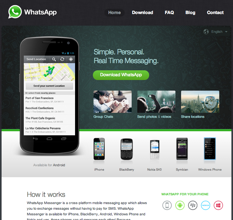
At first glance the website instinctively feels average to me. Nothing about it really stands out. It is clear that the website isn't an important part of the business. The images in the carousel don't have alternate text attributes, and the javascript / css files all could be shrunk by over 50% with compression. (Here is a quick primer on on-page SEO optimization)
Now this got me thinking though, does Whatsapp as a company care about SEO? Why should they? Most users will not come to their website via Google. They will come because a friend recommended that they use Whatsapp to keep in touch. Bearing that in mind, perhaps all they really want is to lead visitors to a download page.
Let's look at their website again, this time with links highlighted.
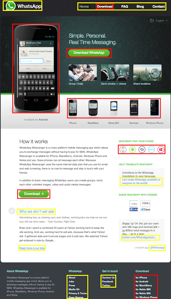
Keep in mind though that this isn't a rigorous statistical analysis so take it with a pinch of salt. With that, let's dive in. There are a total of 9 yellow blocks, representing links unrelated to downloading the app. In addition, 7 links are CTAs (aka. call-to-action) for downloading Whatsapp. This means 7 of 16 (a ratio of 44%) links lead to a download. That's pretty high. By comparison, e-commerce store creator Shopify's homepage has a CTA-to-links ratio of 22% (2 of 9).
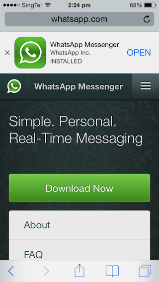
Whatsapp.com on the iPhone
On the iPhone, this laser focus on downloads is even more pronounced. Looking at the first screenshot, you can see that they aren't even trying to persuade the user to try Whatsapp. They make use of Apple's Smart App Banner and also a humongous download button to encourage users to visit their mobile's app store.
Once you scroll past the About section, you see a section about features such as real-time-texting, followed by another massive download button.
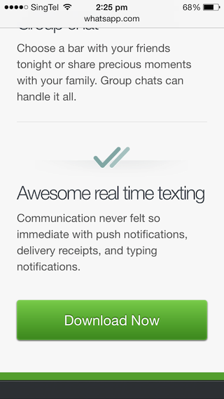
Between the top of the page to the footer (not inclusive), the CTA-to-link ratio is 40% (4 of 10). Again, it seems like a reasonably high figure.
In both the case of the desktop and mobile websites, the CTAs are prominent and spread out throughout the site. They sit above the fold prominently, but are also sprinkled throughout below the fold, offering users several opportunities to convert. It's not much, but even looking at the website offers a glimpse into the culture of Whatsapp - a little conventional, possibly boring, but laser focused on the result!